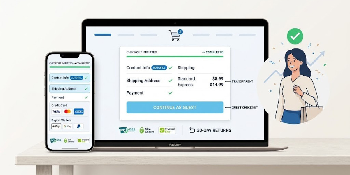

Most online stores do not have a traffic problem. They have a conversion problem. You can spend months building an audience through content marketing, paid campaigns, and social engagement, only to discover that visitors consistently leave before finalising their orders. The investment brings people in, but the website fails to close the deal.
Cart abandonment sits at the core of this disconnect. Shoppers identify products they want, add them to their carts, and begin the checkout process. Then they stop. Distractions play a role, as does buyer hesitation. But the website's own structure — its forms, fees, and friction — is often the decisive factor.
The mechanisms behind cart abandonment are well understood, and so are the remedies. The following features address the specific failure points where stores lose the most customers.
Keep the Cart Constantly Visible and Up to Date
The shopping cart is the customer's ongoing anchor during a browsing session. Its visibility at any moment signals that their selections are saved, accessible, and ready for purchase.
The conventional placement in the upper-right corner remains the most effective choice. It aligns with user expectations developed over years of online shopping. Each time an item is added, the cart must update immediately — reflecting the correct item count and current subtotal.
Opening the cart should not disrupt the browsing experience. A slide-out panel or compact overlay reveals the contents without navigating away from the current page. Shoppers can review selections, adjust quantities, and move toward checkout with minimal interruption.
Allow Purchases Without Forcing Account Registration
Requiring visitors to create an account before they can complete a purchase remains one of the most counterproductive conventions in e-commerce. It adds friction at the exact moment when purchase intent is highest.
Guest checkout should hold the most prominent position on the login screen. Collecting an email for order confirmations is perfectly reasonable. Requiring a password, username, and personal profile before allowing a transaction is not.
There is a better time to invite account creation — after the sale has been completed. The customer has already received value and may appreciate the convenience of a saved profile for future visits. A small incentive for signing up can work well, provided it never obstructs the immediate sale.
Disclose All Fees Before the Checkout Begins
Hidden charges at the final confirmation screen are among the most frequently cited reasons for cart abandonment. The sense of being misled — even slightly — triggers an almost instinctive withdrawal from the purchase.
Present shipping costs as early as the product page. If free shipping applies, make it highly visible. When costs vary by location, include a postal code calculator within the cart so customers can determine their total before investing time in checkout fields.
Taxes should appear with the same transparency. Do not reserve these figures for the very last step. A web design company that has built multiple e-commerce stores knows that upfront pricing disclosure prevents the trust erosion that leads directly to lost sales.
Reduce the Checkout Form to Its Bare Essentials
Every additional field in a checkout form functions as a small tax on the customer's patience. Even questions that seem harmless — a phone number, a referral source, a preferences checkbox — contribute to the cumulative impression that the process is too demanding.
Limit data collection to what is strictly necessary for fulfilment: where to ship, how to bill, and the payment method. Everything else can be gathered later through post-purchase surveys or optional account profiles.
Technical refinements can make even a required form feel significantly lighter. Address autocomplete, auto-populated geographic fields based on postal codes, and dropdown selections all reduce the manual effort involved. These implementation details are where a Singapore web designer with e-commerce experience delivers tangible improvements in completion rates.
Provide Real-Time Feedback When Errors Occur
A form that rejects a completed submission without clearly identifying the problem creates a deeply frustrating experience. The customer must now backtrack through every field to find a single mistake — a process that frequently ends with the tab being closed permanently.
Inline validation addresses this by surfacing issues the moment they arise. A misspelled email address triggers an immediate, specific notification. A missing required field is highlighted as the customer attempts to move past it. Clear messages that explain both the problem and the correction prevent unnecessary confusion.
Browser autocomplete works alongside validation to reduce errors before they happen. When saved personal and payment details populate with a single tap, manual entry — and the mistakes that accompany it — drops substantially. The combination of these two features creates a checkout that feels responsive and supportive rather than punitive.
Support Multiple Payment Methods
The expectation that every customer will pay with a credit card is outdated. Consumer payment preferences have diversified considerably, and checkout systems must evolve to match.
Digital wallets — Apple Pay, Google Pay, PayPal — offer significant speed advantages, particularly on mobile devices. Buy-now-pay-later services such as Klarna and Afterpay give customers the flexibility to spread payments across multiple installments.
Your analytics data reveals which methods and devices matter most to your specific audience. If mobile traffic represents a large share of visitors, wallet integration shifts from a convenience to a requirement. Eliminating the need to manually enter a card number on a small touchscreen directly correlates with fewer abandoned sessions.
Build Trust Through Consistent Visual Design
Entering payment information on a website requires confidence that the transaction is secure. That confidence is partly built through visual cues and partly through design consistency.
Place trust signals — SSL badges, payment processor logos, and guarantee icons — directly adjacent to the payment fields. These elements address concerns at the exact moment they are most active.
The checkout page should also maintain visual alignment with the rest of your site. A sudden change in styling or a redirect to an unfamiliar URL triggers doubt. Preserving your brand identity — colours, fonts, and layout — throughout the entire transaction maintains the trust already established. A web design company that pays attention to these transitions ensures the experience remains seamless from browsing to confirmation.
Trigger Automated Recovery Emails for Left-Behind Carts
Even the most refined checkout cannot prevent every instance of abandonment. External interruptions — a dead battery, an unexpected obligation, a momentary distraction — are simply part of the landscape.
Automated email sequences that activate when carts are abandoned offer a practical way to recover otherwise lost revenue. This feature is standard in virtually every major e-commerce platform.
The recovery email should be concise and action-oriented. Display the abandoned product with a clear image and a direct link that restores the cart to its previous state. A modest incentive — free shipping or a small discount — can be effective, but restraint is important. Overusing promotional hooks trains customers to abandon carts deliberately as a strategy for triggering deals, which undermines the approach over time.
Surface Return Policies in Obvious Locations
Ambiguity about returns causes hesitation at the most consequential moment in the buying journey. Shoppers who cannot quickly determine whether returning an item is simple will often choose not to buy at all.
Make return information accessible from multiple touchpoints: the product page, the shopping cart, and the site footer. Proactive placement signals confidence in your own policies and removes a potential source of doubt.
Use language that requires no interpretation. "Free 30-day returns" is immediately understood and reassuring, whereas dense legal conditions are not. When buyers feel confident that reversing a purchase requires minimal effort, their comfort with completing the transaction rises substantially. A Singapore web designer who understands conversion psychology will integrate this information naturally into the site's structure rather than hiding it in an obscure corner.
Engage Professional Help When the Problem Is Complex
Resolving checkout issues demands a combination of skills that rarely converges in a single individual: understanding of consumer behaviour, technical implementation proficiency, and design consistency.
A qualified professional can evaluate your checkout flow comprehensively and pinpoint exactly where customers disengage. They understand how to restructure forms, integrate payment systems, and conduct testing across devices. Their perspective extends well beyond surface-level cosmetic changes.
For new stores, working with a web design company from the project's earliest stages ensures the checkout is built on a solid foundation. Server configuration, security certificates, and payment gateway integration all require precise, careful implementation from the start. Getting these elements right early prevents costly remediation later and allows you to direct your energy toward serving customers and growing the business.
Closing Thoughts
Complete elimination of cart abandonment is not a realistic objective. Some degree of drop-off accompanies every online transaction, and no design can fully prevent it.
What intentional design accomplishes is reducing abandonment to a manageable level. Accessible cart placement, guest checkout, transparent pricing, and lean forms address the most common friction points. Diverse payment options, visible trust indicators, and automated recovery strategies reinforce the overall experience.
Each unnecessary obstacle removed from the checkout path pushes your conversion rate higher. Test your store on a mobile device, watch how real users navigate the process, and address friction wherever you find it. A checkout experience refined through careful, informed attention is the most dependable tool for turning casual browsers into loyal, paying customers.