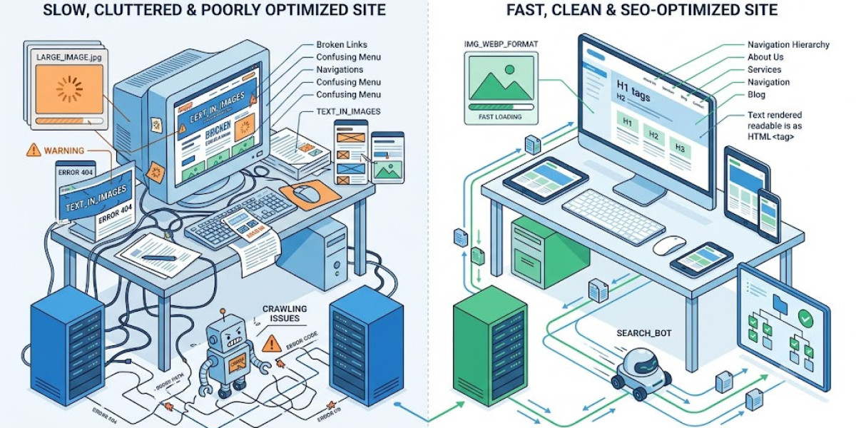

Search engine optimization gets most of its attention through the lens of content. People study keyword trends, analyze competitor articles, and refine meta descriptions. Website appearance, meanwhile, gets handled as an entirely separate effort — chosen for brand identity and visual preference. Very few people consider how the two intersect.
That separation creates a structural blind spot. Search engines do not simply read your words and rank them. They evaluate the entire technical environment your content sits within. From crawlability to load speed to mobile behavior, your site's construction directly shapes search outcomes.
Crawlers Need a Logical Path
Google and other search engines send automated programs across the web to discover pages. These crawlers follow hyperlinks from one destination to the next, reading content and building an index of everything available. How efficiently they move through your site depends on the internal pathways you create.
Messy, inconsistent linking forces crawlers into dead ends. Pages that lack internal links pointing toward them may go completely unindexed. Content buried several layers deep with no supporting links from nearby pages often remains invisible to search algorithms. Duplicate navigation patterns across sections cause crawlers to waste time reprocessing pages they have already visited.
A coherent structure eliminates these friction points. Your homepage branches outward to primary sections. Those sections connect to individual pages and posts. Cross-links between related content create redundant pathways that ensure every page remains reachable through multiple routes.
Designing this framework demands someone who thinks architecturally. The professional who maps your site's page relationships establishes the invisible skeleton that determines whether search engines can fully discover everything you publish.
Mobile Rendering Drives Ranking Decisions
Google evaluates your site based on how it appears and functions on mobile devices. This is not a secondary check performed after desktop assessment. The mobile version of your site is the version that determines your ranking position. Desktop presentation carries secondary weight in this evaluation.
Responsive construction solves this by treating every layout element as adaptable. Column widths adjust to available screen space. Images resize proportionally within their containers rather than overflowing or requiring horizontal scrolling. Navigation menus compress into compact, touch-friendly formats that remain fully functional on small screens.
When visitors land on a page that forces them to zoom, pinch, or scroll sideways just to read a paragraph, they leave immediately. Those departures register as negative behavioral signals. Over time, consistent mobile friction produces measurable ranking disadvantages against competitors offering smoother handheld experiences.
Every Visual Element Adds Processing Weight
Performance discussions rarely examine the contribution of purely aesthetic choices. Yet every photograph, animation, and custom font file adds demand to each page visit. A homepage featuring multiple uncompressed images at full resolution loads dramatically slower than one where those same visuals have been optimized thoughtfully.
Search engines penalize slow loading. They prefer to direct users toward pages that render quickly and deliver content within seconds. Pages exceeding three or four seconds of load time attract elevated bounce rates, which feed directly into ranking calculations as evidence of subpar experience.
Producing fast pages alongside rich visuals requires deliberate effort. Compressing image files while preserving acceptable quality, selecting typefaces with efficient file structures, serving graphics in modern formats like WebP, and limiting decorative animations to moments where they genuinely contribute — these are not optional refinements. They are essential practices.
Someone with both creative judgment and technical competence evaluates these trade-offs throughout development. They measure rendering performance at each stage, adjusting before problems become embedded in the finished product.
Visitor Behavior Reveals Design Quality
Search algorithms incorporate real user behavior into their ranking models. Time spent reading a page, the number of additional pages explored during a single visit, and whether someone immediately returns to search results all provide data about page quality. These are not abstract metrics. They are measurements of satisfaction.
Design directly shapes these measurements. Inconsistent spacing between content blocks creates visual clutter that discourages sustained reading. Navigation labels using internal jargon instead of plain language leave visitors guessing about their next action. Pages without clear typographic hierarchy force readers into exhausting scanning patterns rather than comfortable, sequential reading.
Pages with intentional layout rhythm hold attention naturally. Prominent headings guide readers through information sequentially. Generous whitespace between sections provides breathing room that makes content feel approachable. Related content links placed at natural pause points invite visitors to explore further without searching for the next step.
These outcomes emerge from deliberate decisions about spacing, hierarchy, and flow made during the construction phase. They are not accidental byproducts of choosing attractive colors.
Text Trapped Inside Graphics
A recurring issue on business websites involves placing critical messaging inside image files rather than coding them as HTML text. A homepage banner incorporates the company's primary value proposition as part of a JPEG graphic. The visual result looks professional. The search consequence undermines that effort significantly.
Crawlers read structured markup — HTML text elements, heading tags, and coded content. They do not analyze pixels within image files to extract individual words. When your most strategically important language exists only as a graphic element, search engines receive zero contextual information from those words.
The resolution requires no visual compromise. Essential text remains coded as HTML. CSS provides extensive creative capabilities — custom font selections with varied weights, letter-spacing adjustments, gradient effects applied to text containers, and responsive sizing that adapts to any viewport. The rendered presentation can match any image-based approach while remaining fully machine-readable.
This principle should be established during initial planning. A web designer who understands search mechanics treats embedded text as a technical problem to prevent rather than an aesthetic technique to pursue.
Layout Stability and Core Web Vitals
Google measures Cumulative Layout Shift as part of its Core Web Vital standards. This metric tracks unexpected movement of visible content during page loading. The most frequent causes are asynchronous elements — images, advertisements, or embedded media that render after the initial page structure has already displayed to visitors.
These shifts produce frustrating interruptions. Someone reaching for a button finds it displaced by a late-loading image. A reader watching a paragraph suddenly jump downward because an advertisement injected itself above the text breaks concentration and erodes trust in the page.
Preventing these disruptions requires advance planning. Every image needs explicit width and height constraints assigned before loading begins. Font delivery strategies must minimize text reflow during the transition from system fallback to custom typeface. Advertisement containers need predetermined dimensions that maintain consistent spatial structure regardless of when ad content finishes loading.
Solving these problems demands someone fluent in both visual and engineering domains. A website designer Singapore with deep technical expertise addresses rendering behavior proactively during construction rather than treating layout instability as something to fix after launch.
Choosing Who Builds Your Foundation
Exceptional content published on a structurally compromised website consistently falls short of its potential. The intersection where written material meets its technical container determines whether any page achieves meaningful search visibility. When these disciplines operate independently of each other, both suffer.
The professional or team you engage to build your site shapes outcomes that persist long after launch. Someone who integrates search considerations into the design process from the beginning establishes conditions that support organic visibility. Retrofitting optimization into an already-completed structure typically requires expensive rework that could have been avoided entirely.
For larger projects spanning multiple requirements, a capable web design agency evaluates architecture, performance, responsiveness, and visual quality as interconnected variables rather than independent tasks. This integrated approach prevents the fragmented decision-making that undermines sites built by teams operating in isolation.
The Integrated Reality
Your website's visual layer and its search engine performance are not separate systems that happen to share the same domain. They influence each other at every level. Structural choices determine how thoroughly crawlers index your content. Speed influences whether visitors stay long enough to read it. Usability shapes every interaction between your audience and your brand message.
Achieving sustainable search visibility requires coordination across every dimension of your digital presence. Engage someone who understands how creative decisions reverberate through search algorithms. Build with both audiences in mind — the humans reading your pages and the systems deciding whether they ever reach them. That integration is what separates websites that rank from those that disappear.